 Title: Me
Course: Advanced Design Artist: Samantha Schmidt Teacher: Mr. Salyers Subject Matter: Me Medium: Pencil Project Goal: Improve shading and proportioning skills Personal Review/Evaluation and Critique: I feel as though this piece turned out well. I think I spaced out the drawing on the paper well, placing lines and the abcense of lines in the proper places. It has a nice form for the face. There's balance for either side of the face, the proportioning and positioning mirroring. There's unity within the piece overall. I liked being able to draw a person for this project, but disliked the amount of time it required, and the fact that we had to draw ourselves. I could improve on my proportining a bit here and there. My strength was my shading on the hair, and my weakness was shading on the dress. I'd put more time into proportioning out where everything was if I were to do this project again. Overall I feel as though it turned out well, but I could still improve significantly especially with proportioning and shading.
0 Comments
 Title: Hamilton
Course: Advanced Design Artist: Samantha Schmidt Teacher: Mr. Salyers Subject Matter: Book Medium: Book Project Goal: Cut through the pages as smoothly as possibly Personal Review/Evaluation and Critique: I feel as though this turned out well. Through the use of smooth, striaght lines I and the star shape/outline of the figure I feel as though it made a balanced and neat piece. The piece feels well balanced on the page, not being too big or too small. Each point of the star has proper proportioning and the contining of the star shape by the figures outline creates a sense of unity and balance. I feel as though i could of improved by carving the figure out more carefull, but that I did well with carving out the star. If I did this project again I would be more careful when carving as to not accidentally cut a page in too far. I'd never worked on a project that involved carving, so this project allowed me to get familiar with the uses of the tools that I made this project with. 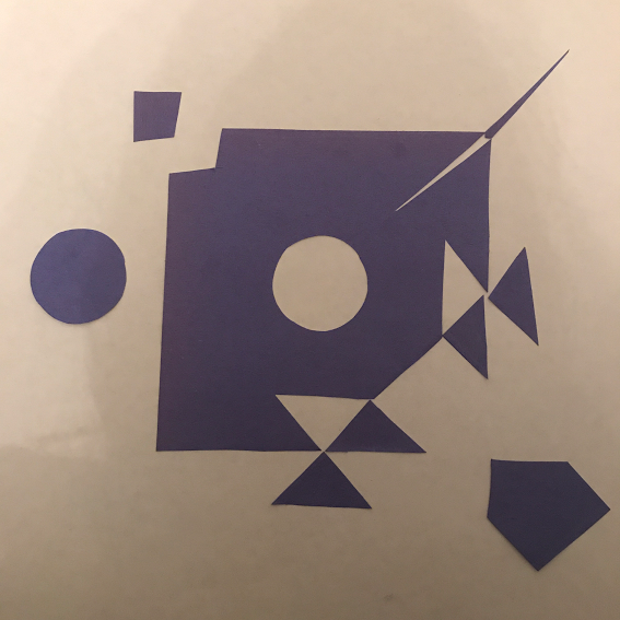 Title: Blue
Course: Advanced Design Artist: Samantha Schmidt Teacher: Mr. Salyers Subject Matter: Geometry Medium: Construction Paper Project Goal: Create a balanced and contrasting piece Personal Review/Evaluation and Critique: The piece overall feels appealing to the eye to me. I carefully cut out the shapes of the peice and used a darker color of blue to emphasize the contrast. The line between the white and the blue paper emphasizes the contrast. The piece features a variety of shapes within it but still feels well balanced due to where the patterns are positioned in the peiced. There is a sense of rythm within the piece. I feel as though a strength on this project was making the piece feel neat and balanced. I could improve on further pieces like this one by adding more shapes to it to emphasize the contrast. If I were to do this project again I would put more planning into the process of designing it before hand. I feel as though this project turned out well and is pleasing to the eye.   Title: Be The Change
Course: Advanced Design Artist: Samantha Schmidt Teacher: Mr. Salyers Subject Matter: MHS Football Medium: Pencil Project Goal: Create a unique logo design Personal Review/Evaluation and Critique: The logos within this piece were unique and well thought out. The use of shape, form, and space makes the logos appear pleasing to the eye by makin the key factors of the logo stand out. There's balance within the logos, some of them having line that creates a sense of movement. There's a variety of themes in the logos but also a sense of unity as they all fall under the same theme. If I were to do this project again I would be careful to make my lines neater and put more time into the planning process. I feel as thought I did well with generating creative ideas and putting them on paper.  Title: Camera
Course: Advanced Design Artist: Samantha Schmidt Teacher: Mr. Salyers Subject Matter: Camera Medium: Pencil Project Goal: Sketch a 3D image Personal Review/Evaluation and Critique: I'm very pleased with how this project turned out. The shaping of the image shows a proper use of proportioning within the piece. There shading creates a sense of texture over the camera and the black and white coloring adds to the emotion of the overall work. Due to the proper proportioning, there's a sense of balance and unity across the work while putting emphasis on the shading. If I were to do this project again I would spend more time on smoothing out the shading, but I feel as though I did well with the proportioning within the piece. I'm pleased with how the project turned out and would do the project again. I enjoyed the freedom we had when making the piece.  Title: Sunflower Shoe
Course: Advanced Design Artist: Samantha Schmidt Teacher: Mr. Salyers Subject Matter: Shoe & Sunflower Medium: Colored Pencil Project Goal: Design a creative shoe with a unique theme Personal Review/Evaluation and Critique: For this project my theme was a sunflower. The shading adds texture to the piece through its shading. The spacing of the leafs, form of the flower and vines, and overall coloring of the project really adds a sense of variety and creaivity to the shoe. The proportioning of the leafs and the petals on the flower really line up, making the piece as a whole feel balanced and unified. I enjoyed doing this project due to how different it was to other projects. I disliked how we had a certain date the project had to be done by. A strength on this project was coloring/shading and creating a unique ideas. I could improve by more neatly lining the items on the shoe. I enjoyed this project and like how it turned out.  Title: Red Mask
Course: Advanced Design Artist: Samantha Schmidt Teacher: Mr. Salyers Subject Matter: Mask Medium: Temperate Paint Project Goal: Create a unique, culturistic design Personal Review/Evaluation and Critique: I like how this project turned out. The lines between the colors are cleary defined and seperate the shapes within the design. The colors in the design add to the emotion of the overall project, as does the spacing out and proportioning of the shapes. The piece feels balanced and unified due to the mirrioring of the shapes on either side of the face. There's feeling of movement added by the lines down the face. I enjoyed the idea of making a mask on this project, but disliked how the paint kept cracking and peeling off. If I were to do this project again, I'd use a different paint and be careful to more carefully define the shapes within it. I liked the use of the shapes within the project. Overall I feel as though it turned out well.  Title: Ool Google Design
Course: Advanced Design Artist: Samantha Schmidt Teacher: Mr. Salyers Subject Matter: Google Logo Medium: Pencil Project Goal: Create a unique design for the google logo Personal Review/Evaluation and Critique: The use of shape, line, form, and spacing creates a appealing image. The piece feels balanced and unified through its more bubbly design but has an established rythm due to the variety of patterns within it. A strength of mine was generating a creative idea, but I feel as though I could of added more to the peice. I liked this project because it presented us with many ideas, but disliked the simplicity of it. I feel as though the project turned out well. 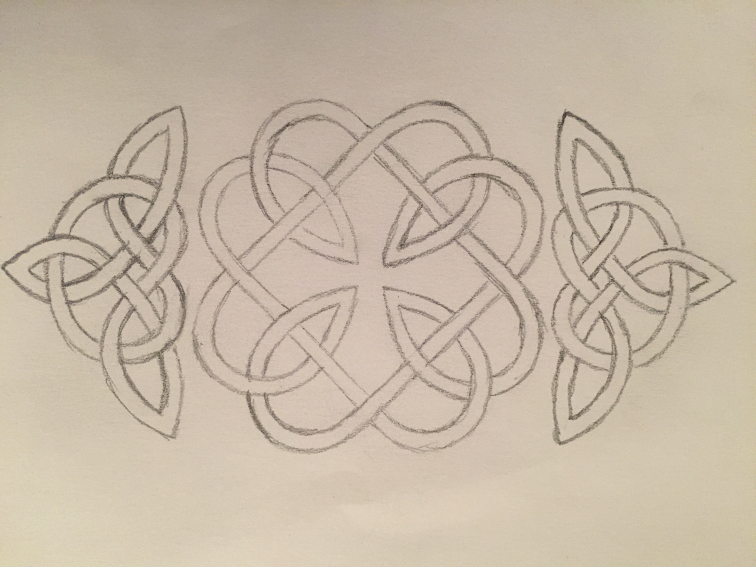 Title: Cultural Pattern
Course: Advanced Design Artist: Samantha Schmidt Teacher: Mr. Salyers Subject Matter: Celtic Pattern Medium: Pencil Project Goal: Create a unique cultural design Personal Review/Evaluation and Critique: Through the use of line, shape, and form this piece feels balanced and unified. It has a sense of movement through the flow of the lines on the page. There's balance and unity due to the mirroring the piece has across the page. I enjoyed doing doing this project because of how much creativity could go into it and I feel as though I did well with neatly laying out the design. If I were to go back and do this project again I would of outlined it in sharpie or pen to add contrast with its white background. I'm happy with how this project turned out and hope to make more designs in the future.   Title: Zentangle Box
Course: Advanced Design Artist: Samantha Schmidt Teacher: Mr. Salyers Subject Matter: Zentangle Medium: Sharpie Project Goal: Create a unique zentangle design on a 3D shape Personal Review/Evaluation and Critique: The line, shape, and black and white color of the piece adds to the overall appearance. The black & white color creates contrast and the shape & line makes the piece feel neat. The flow of the shapes creates a sense of movement. There's a variety of patterns within this piece that creates a sense of balance throughout it. I enjoyed being able to put the design on a 3D figure but disliked how long it took to draw out the design. If I were to do this project again I would more carefully outline the shapes. I feel as though I did well thinking of unique shapes to add to the drawing. I like how this project turned out. |
