    Course: Digital Photography
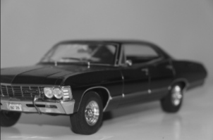
Artist: Samantha Schmidt Teacher: Mrs. Gollan Subject Matter: Aaron Siskind Medium: Photography Evaluation: I liked being able to set the camera to a black and white setting for this project. I didn't like how in some of the images it dulled the affect that it had in some ways. I liked how I positioned the items for this project, but disliked how how much whitespace there ended up being in them. My favorite image for this project was the one with the car. The model of the car is a '67 Chevy Impala, which is one of my favorite cars, so using it for the project helped me add a bit of myself to it. How the space in the images is distributed I feel really adds more feeling to the images, along with the angles that the objects are viewed at. The black and white of the images can give more of a smooth or rough view of the image depending on how the shades collide. The shape of the objects in the image and how they are placed also impacts the affect of the image. The angle of the objects in the images help to give an illusion of movement. The placement of the objects also helps to create a balance throughout each image.
0 Comments
            Course: Digital Photography
Artist: Samantha Schmidt Teacher: Mrs. Gollan Subject Matter: Photo Essay Medium: Photography Evaluation: I liked having more freedom with this topic, but disliked the number of photos that were supposed to be taken for it. It often became difficult to find something to take a picture of that wasn't too similar to the other images. For this project I could of improved by finding better things to take pictures of to keep a consistent theme, but did well at composing the photos over all. The colors of the images help to set a mood for the photos, either creating energy or a more mellow tone. The placement of the subject of the images are well balanced for the space and help to emphasize the shape of the subjects. This also helps give and illusion of unity and movement to some of the images, especially the picture with the bridge.         Course: Digital Photography
Artist: Samantha Schmidt Teacher: Mrs. Gollan Subject Matter: Staple City Medium: Photography Evaluation: I liked using the different colored filters to add an affect to the images. I disliked that the project could only use staples. I think I did well with picking different filters with various colors for the project. I could of improved with placement of the staples to add a more city feel. The color in the images helps to give bit of an energetic feel to the photographs. The texture of the metal on the staples helps to make them look more like skyscrapers. The spacing of the staples is similar to that of a city lay out, somewhat following a grid form. The staples standing like they are helps to create movement vertically, while the texturing on the staples helps to create movement horizontally. This overall creates a balance to the image.        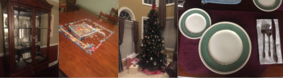   Course: Digital Photography
Artist: Samantha Schmidt Teacher: Mrs. Gollan Subject Matter: Thanksgiving Medium: Photography Evaluation: I enjoyed the theme of this project and being able to create a photoset that surrounds a holiday. I disliked having specific topics that had to be met for the project. I feel like a strength of this project was keep a consistent color theme throughout the photoset, but could improve on sticking with the topics of the photoset. The shapes of the topics of the images are emphasized by the angles of the photos and the spacing of the objects in the photos. The angles of the photos also help create an illusion of movement throughout the images and at times the subject of the pictures can put emphasis on the theme.     Course: Digital Photography
Artist: Samantha Schmidt Teacher: Mrs. Gollan Subject Matter: On Location Portraits Medium: Photography Evaluation: I liked being able to take these pictures outside. I disliked having to find many angles to take the photos at. I think a strength was finding a good location to do this project at. I think I could of improved the images by changing how she was standing in the images. The spacing of the image could of probably been done a bit better by using the rule of thirds. The coloring of the trees helps to set a mood in the image, giving a feel of autumn. The lines of the windows in the background help give a sense of symmetry. The lines of the windows help to balance the images and do create a bit of emphasis on the background.      Course: Digital Photography
Artist: Samantha Schmidt Teacher: Mrs. Gollan Subject Matter: Remembering The Egg Medium: Photography Evaluation: I liked seeing the affects of the light being shined on the egg at different angles when doing this project. I disliked the simplicity of the project as a whole. I think I did well with finding various angles for the lighting, but could of improved on focusing the camera on the egg. The black and white colors of the image help to create a feel that's almost mellow or monotone. The rounding shape of the egg gives a sense of calm, as does the smooth texture of the egg. The gray shadow on the egg caste by the light creates balance throughout the image, and puts emphasis on the roundness of the egg. The different angles of the lighting create variety for the project.    Course: Digital Photography
Artist: Samantha Schmidt Teacher: Mrs. Gollan Subject Matter: Toy Story Medium: Photography Evaluation: I enjoyed being able to used toys for this project. It gave a lot more freedom to use my creativity in the photographs. I disliked having to create a written story to go with the images, as my creativity is more visual than lingual. I did well at composing and positioning the characters in the photo story, but probably could of done better at creating the backgrounds for the scenes. The colors of the images help to imply that it's a later in the day sometime during the winter. The texture of the materials used in the images give an illusion of what they represent, such as the cotton representing snow. The spacing of the images helps add a sense of balance throughout the story. The position of the character in one of the images provides a sense of movement because it looks like he's running.                         Course: Digital Photography
Artist: Samantha Schmidt Teacher: Mrs. Gollan Subject Matter: I Am Milford Medium: Photography Evaluation: I liked how this project allowed me to capture various aspects of school life. I disliked how we weren't able to work on the project at home if we needed to. I think I did well at angling the shots for the photographs, but could of probably included more photos of the interior of the building. The lines of the buildings help to create a sense of symmetry to the photographs. The colors also give off a feeling similar to what is felt when on the campus. The spacing of the images I think was done well because it often includes a lot in the photo but doesn't make it look unbalanced. All of the images are overall balanced and can create a sense of movement in how a building is angled in the shot.  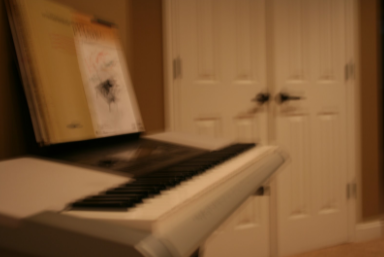   Course: Digital Photography
Artist: Samantha Schmidt Teacher: Mrs. Gollan Subject Matter: ISO Assignment Medium: Photography Evaluation: I liked this project because it gave me an opportunity to experiment with different settings on the camera. I disliked the project because changing the settings could often get confusing when taking a photo. I think I could of improved on using a larger variety of ISO settings, but I think I did well at keeping the comparison photos in close to the same position for the flowers. The blurring of the colors in the images help to show the change in the ISO settings, as do the dulling of the textures and the changing emphasis in the lines. The curving of the leaves in the flower photo and the angle of the keyboard help to create movement in the photos.           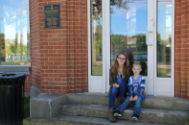       Course: Digital Photography
Artist: Samantha Schmidt Teacher: Mrs. Gollan Subject Matter: Ultimate Selfies Medium: Photography Evaluation: I liked being able to have a vast amount of freedom with this project, but disliked having to be in some of the images because it meant someone else was taking the picture. I think a strength of this project was keeping a consistent theme throughout the images. I think I could of improved the project by taking more photos at some of the locations. The colors of the project help give an energized, summer feel. The space gives an open feel to the image and the lines outlining the environment help to bring attention to the background. The similar color scheme helps give a feeling of unity within the photoset and helps to emphasize the summer feel. |
